Mirage 7
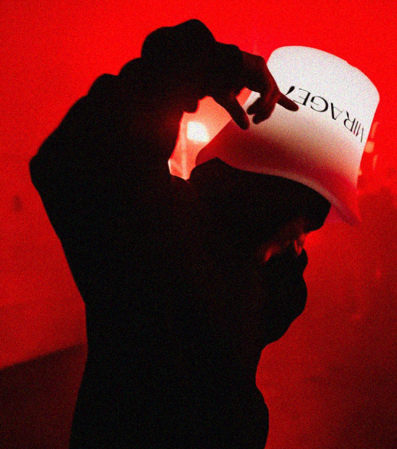
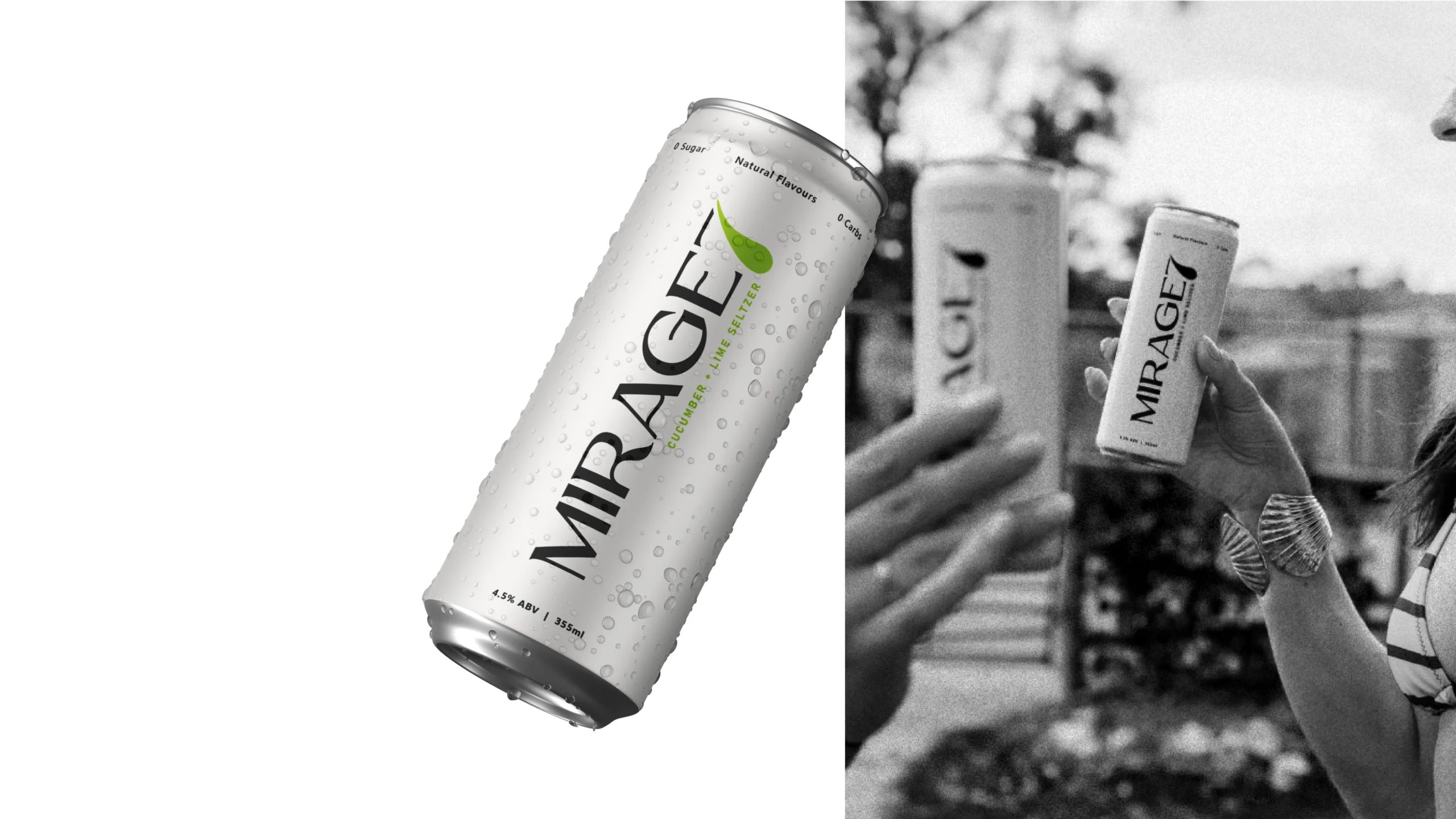
Mirage 7 was created to bring a bold new presence to the hard seltzer market. In a category dominated by familiar messages of refreshment, low calories and clean drinking, the brand needed a distinctive identity that could capture attention and build recognition.
...

Brand Vision
Full flavour. No baggage.
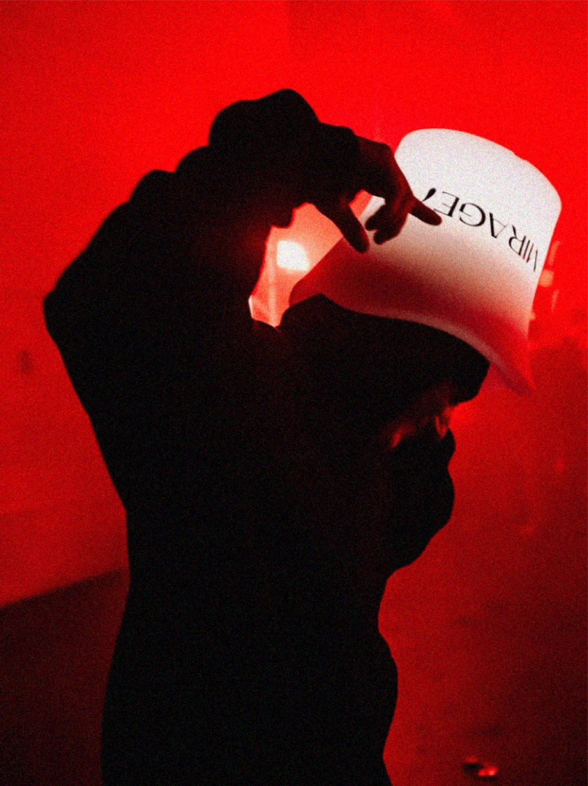
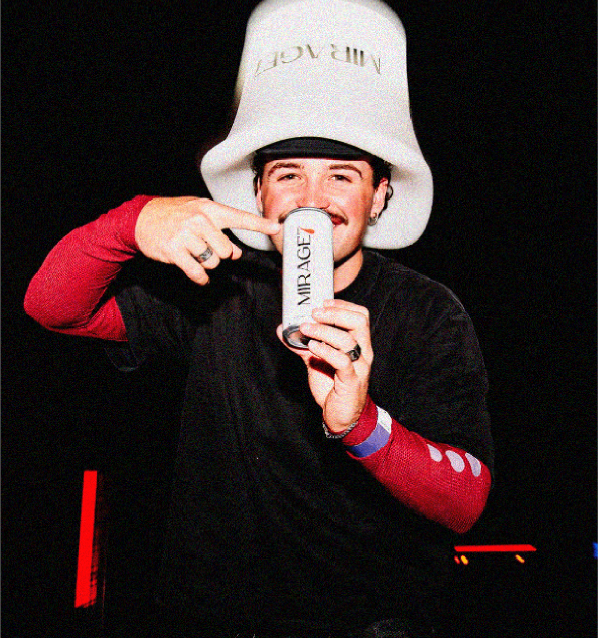
Mirage 7 is positioned for a new generation of social drinkers looking for flavour, personality and a lighter drinking experience.
Rather than following traditional seltzer aesthetics, the brand embraces a confident and contemporary attitude — balancing simplicity with enough energy to stand out in a highly competitive category.
Clean. Modern. Effortless.
Visual Identity
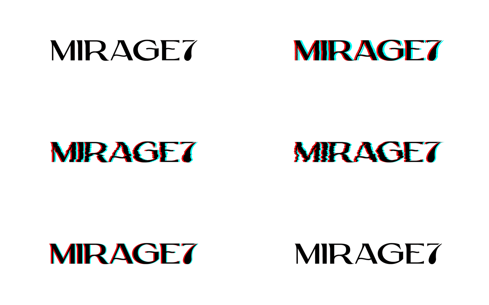
The Mirage 7 identity is built around simplicity and recognition.
Bold typography and a distinctive 7 give the brand a strong visual signature, while a refined foundation creates space for expressive flavour graphics and colour.
The result is a flexible identity designed to remain recognisable across packaging, digital and future brand applications.


Packaging Design
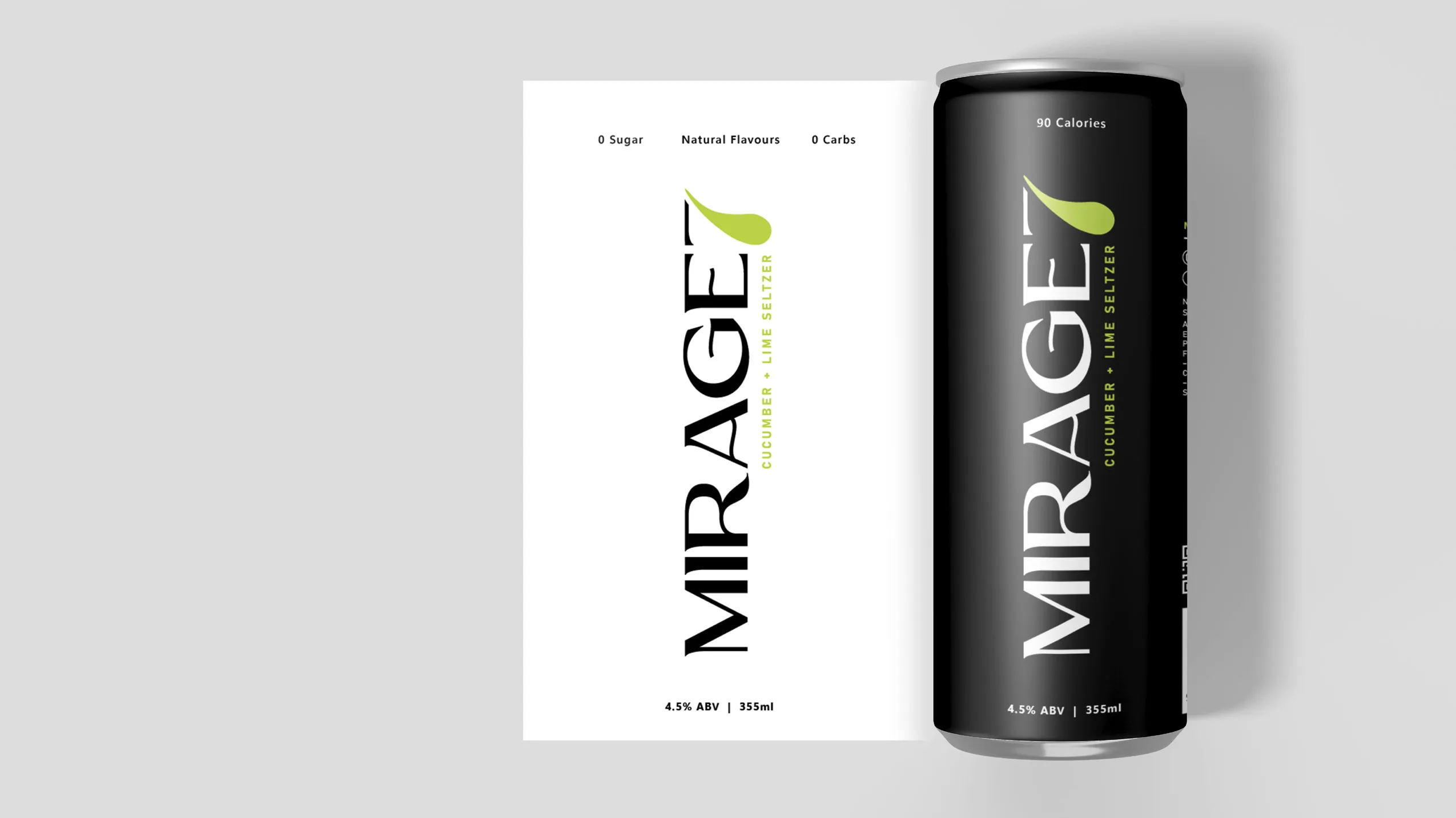
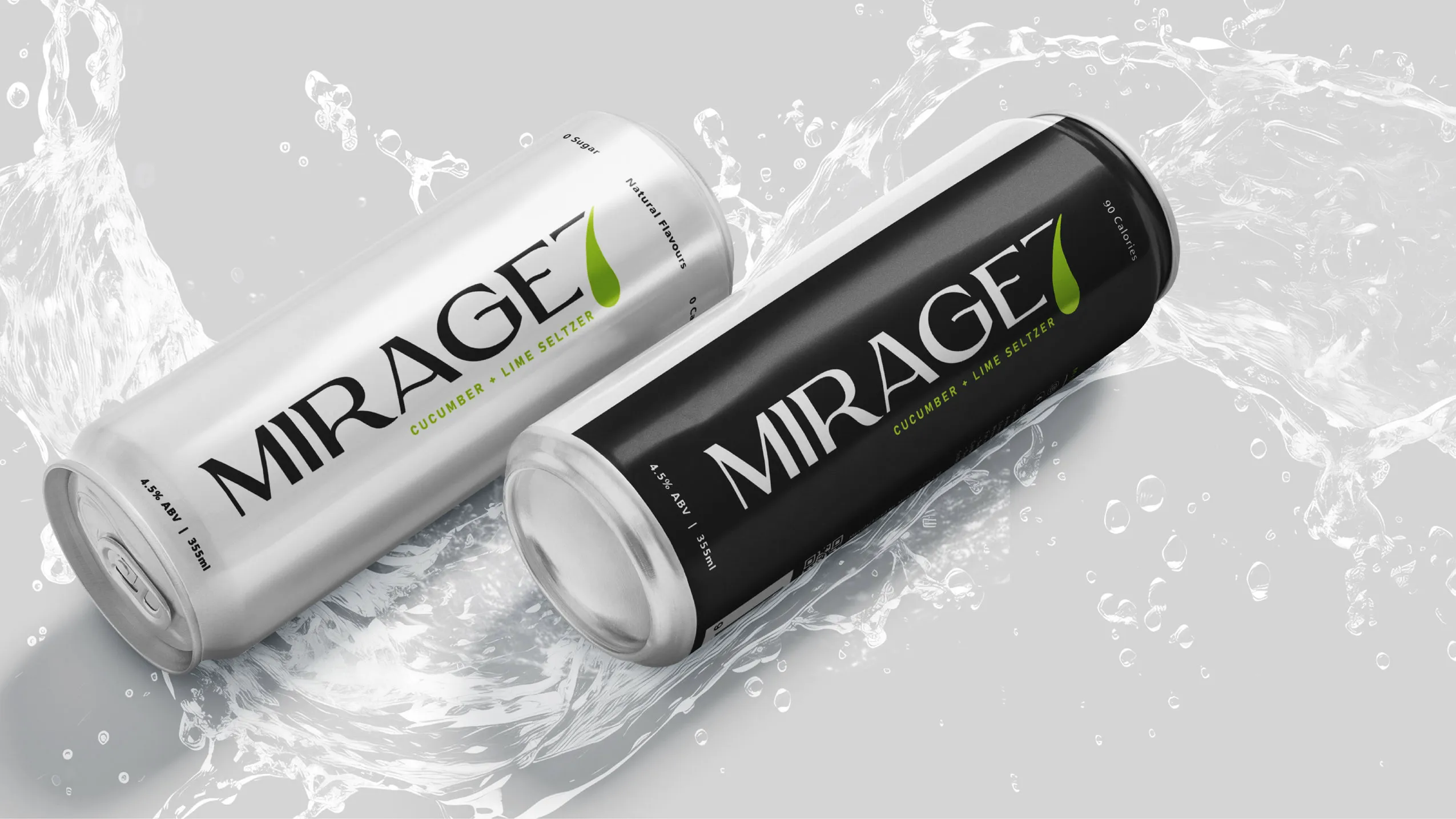
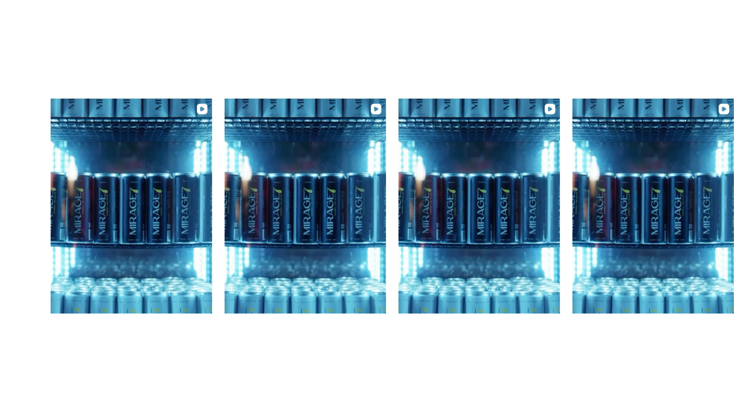
The Mirage 7 Hard Seltzer Packaging Design was developed for maximum shelf impact and clear product navigation.
Strong branding leads the composition, supported by bold flavour cues that differentiate each variety while maintaining consistency across the range.
Together, the cans create a cohesive and highly recognisable family — designed to stand confidently both individually and as a complete range.
Built to Grow
Mirage 7 was designed as a scalable brand rather than a single product.
A consistent packaging architecture allows new flavours and future products to be introduced while maintaining a strong master-brand presence.
This creates a flexible visual system capable of evolving with the brand while building recognition at every touchpoint.